 |
| Digipak from international artist Rihanna |
Unlike a digipak, a jewel CD case is very simplistic in that it consists only of four sections: two sides on the interior and two on the exterior. the CD is held in a plastic tray on the inside and most of the information about the CD, songs and artist is on the outside. While a jewel CD case is a simplistic plastic case, a digipak consists of six sides and holds a lot more information. Digipaks can hold more than one CD as they sometimes include a bonus track or special edition of the CD. Digipaks are a more recent way of marketing albums as they became popular in the 2000s, outselling jewel CD cases that had been prior, since 1982.
A digipak is more effective in terms of building a relationship with an artist because it supplies the audience with more information which makes it seem more personal.
 I went onto Google Images and searched for previous media students digipak's in order to get ideas for my own digipak and see how people in my situation have created their own. I came across this digipak which gave me the idea for my CD image. Also most of the performance scenes in my music video take place in field/forest-like settings. Therefore a natural theme such as the one seen in this digipak, will be a good idea to incorporate into my digipak as it applies to my music video. As a result, I have decided to have the images of my artist that will appear on my digipak be taken in these natural settings that my group filmed in. Furthermore, I believe that the simplistic style of this digipak works well as it is not too crowded and complicated and will therefore be easy for the audience to understand. Because of this I have decided to try and keep my digipak simplistic by having one simple image on my CD cover such as a leaf like in this example or a flower. This way it will fit in with the natural theme but it will be black and white in order to keep the grey-scale filter consistent throughout the entire digipak.
 Another digipak I came across was also from an A level student who used to attend my school. I like this digipak because it is simple yet clearly gets the indie conventions across. Also I like the colour scheme of this digipak as it is similar to my ideas in terms of being black and white. However, the colour pink is a common theme and although I initially intended to have the entirety of my digipak black and white. But now I am considering interpreting one pastel colour as pastel is conventional to the indie genre and having one colour makes the connotations of it stand out. I am going to use the colour blue as y artist wore blue in our first photo shoot so it will fit in well and also blue has connotations of sadness which is relevant to my chosen songs theme of sadness. Lastly, the message to fans image will be of clouds so the colour blue will fit in well there.
 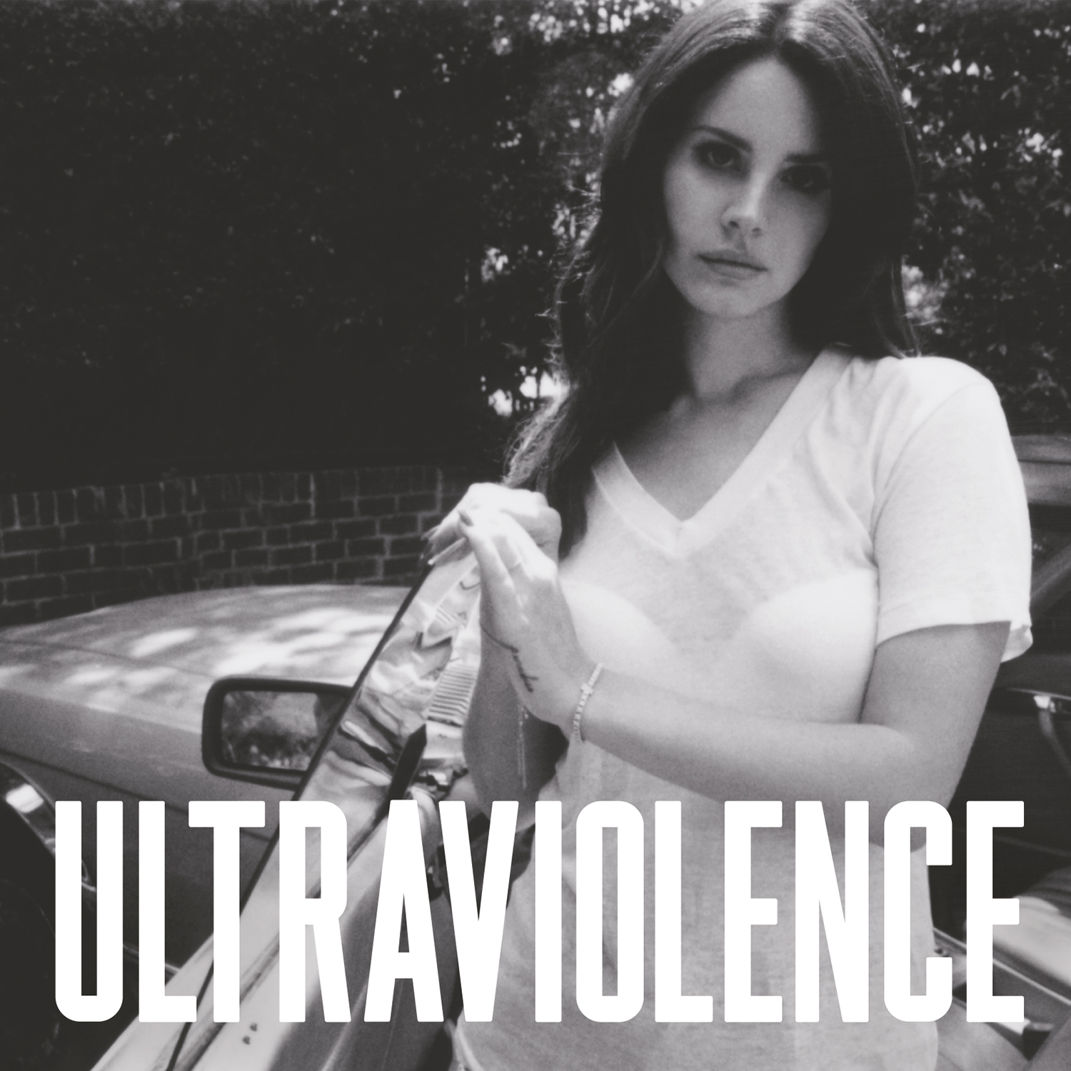 This is my third inspiration and is an image from indie artist Lana Del Rey's album 'Ultraviolence'. This image has inspired my front cover image for my digipak because I believe recreating something similar will work well in terms of my digipak and artists style/theme. I will take a simple profile shot of my artist like this for my digipak front cover and I will try to keep it very simple like this as I will edit it quite a lot and so would not want the cover to look too busy and complicated.
 I will be creating a digipak for my chosen artist 'Kerry' and it will be made up of six sections. The first is the front cover and will show a simple mid shot image of my artist with a natural background such as a field. The background will be edited to black and white yet the artist will remain in colour. An effect will be applied just to the artist whereby the image is made up of loads of smaller versions of the image. 'Kerry' will be printed in bold capital letters in white at the bottom of the square and underneath that in a font resembling a heart scan it will read "Memory Lane" in black. The back of the digipak will list the songs on the album and I have decided to keep this side simple and have the songs in a a smile black font with grey and white stripes which alternate for each song title. The CD will be kept simple and to fit in with the natural setting theme I will have a picture of flowers/leaves on it and it will be black and white to continue the grayscale theme throughout. The fourth section will be where a message to the fans is printed. I will write the message in an image of clouds. The last two slides will just be of artwork of the artist. I will take two images from our photo shoot and place them here. Again, they will be printed in black and white but leaving the artist in colour. Planning my digipak before creating it was helpful because it helped me keep track of all my ideas and create clear guidelines to follow when creating it which allows me to create an effective digipak.
The grey-scale filter which is persistent throughout my whole digipak portrays the locations as dull and depressing which contrasts with the artist who will be in colour. This suggests that the artist is positive even when everything around her is negative which allows the audience to build a relationship with her as she is represented as a good role model with a optimistic outlook. This effect is also engaging for the audience as their focus is entirely on the artist as she stands out due to being in colour. This could furthermore suggest that the artist has a bright personality and so the audience can build a stronger relationship with her through believing they know her better.
The only main colour that will feature in this digipak is blue. Connotations of this colour include sadness and loneliness which are both negative emotions and so because the subject of the album/song is relationships then the audience can infer that the relationship was dysfunctional and unhealthy. On the other hand though, blue has representations of integrity which could suggest the artists decision to break up to escape the problematic relationship. Peace is another connotation of this colour which could occur after the relationship has ended and the artist has become content with being single again. Because of these connotations I believe blue is an effective colour to use as it portrays several stages of the relationship sung about in my chosen song.
The images used will all help to create certain connotations and portray the artist in a specific way. The front cover image will be a mid shot of the artist standing in a green setting such as a field. The image will have a black and white filter applied but erased over the artist so she is the only aspect in colour. The image will not be too complicated as the artist will just be standing with a neutral or thoughtful facial expression, looking towards the camera. I will use editing to create an effect whereby the image of the artist will look as though it has been made up of a load of smaller versions of the image. This can be achieved on photo shop or using a filter on a clip on Final Cut Pro and then screen-shotting it so it becomes a still image. This is effective because it portrays how the artists mind is racing and how she is overwhelmed by perhaps her memories, that are sung about in my chosen song. Furthermore this image will be conventional because the artist is looking straight at the camera which portrays her as serious , dominant and in control in terms of her music and image. This further suggests that the artist is serious about connecting with the audience by looking directly at them which means the audience are more likely to build a relationship with her. This is because they will respect that she is taking their relationship seriously and trying to directly address them which makes them feel closer to the artist as a whole.
The other two images of the artist will be less intimate. She will not be connecting directly with the audience at all. These images will be places on the inside of the digipak and show the artist wearing a denim dress with a long sleeved black top underneath. In one image she is walking across a bridge and the image is taken from behind her and in the other picture she is standing in front of a lake. again, the entire image besides the artist will be made into black and white. This represents the artist as carefree and easy going as she does not care that she is walking through a dark and cold place in only a dress. She also does not care that she is standing out due to being in colour which makes her a good role model because she is teaching the audience to stand out and be themselves. A further connotation of this image is that the artist is brave and is confronting the bad times she has been through. The gloomy field/forest represent dark times she has been through or is going through and in the images, particularly the first one, she is embracing her bad times - walking into the forest etc. This is conventional to the indie music genre because the theme is dark moments from the artists past and it is common for indie artists to share personal experiences as they write their own songs.
Contrastingly though, these images can be seen as unconventional as the artists face is almost completely hidden in both as she is far away and not facing the camera. This is unconventional because an artist tends to include a number of close-up or clear images of themselves facing the camera on their debut album so they can introduce themselves to the audience. However, I believe that having the artist slightly hidden will intrigue the audience as it represents her as mysterious. This creates enigma and will make the audience ask questions about what the artist is like. As a result, the audience will want to buy the album to find out more about the artist and her music.
The font of the artists name will be kept simple in order to appear bold and to be conventional. Having it all in large capital letters and simply white will make it stand out from the grey on most of the rest of the digipak. White also has connotations of innocence and being pure which may represent the artist who remains innocent even in her bad times that are portrayed by the grey surrounding the white. Underneath the artists name on the front cover will be the name of the album 'Memory Lane'. This will be written in a font that resembles a heart scan that shows up on the screen. This has connotations of hearts and love so is conventional to my chosen song which is about heartbreak. This will be written in black to juxtapose with the white of the artists name.
This planning post will assist me in constructing my product on Photoshop because it helped me to identify what I want my digipak to look like in terms of images, layout and colours etc. It has helped me to visualise a clear image and idea of it so I will know exactly what to include when it comes to creating it. It has helped me do so by considering various inspirations I have gained from other students or artists existing digipaks and how these will give me ideas for my own. Therefore I am very clear in my understanding of how I want my digipak to look.
This post demonstrates a proficient understanding of how you visualise your digipak to look like. You have made a start with considering the various inspirations that you have gathered from existing and student texts and the ways in which you would like to create your product. Your analysis demonstrates proficient planning techniques and this is because you have explored the role of indie conventions and the ways in which your product can connect to your audience. You have also focused on the colour, images and layouts that you would like to include.
ReplyDeleteAim-
1) Add a conclusion to explain how this planning post will assist you with constructing your product on photoshop.